

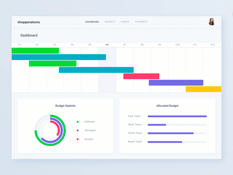
The dashboard is Database driven application tool that is used for the management of information visually. The basic duty of the dashboard is to organize and store data in such a manner that it can display information from various data sources into one clear and conscience way that helps in critical decision making.
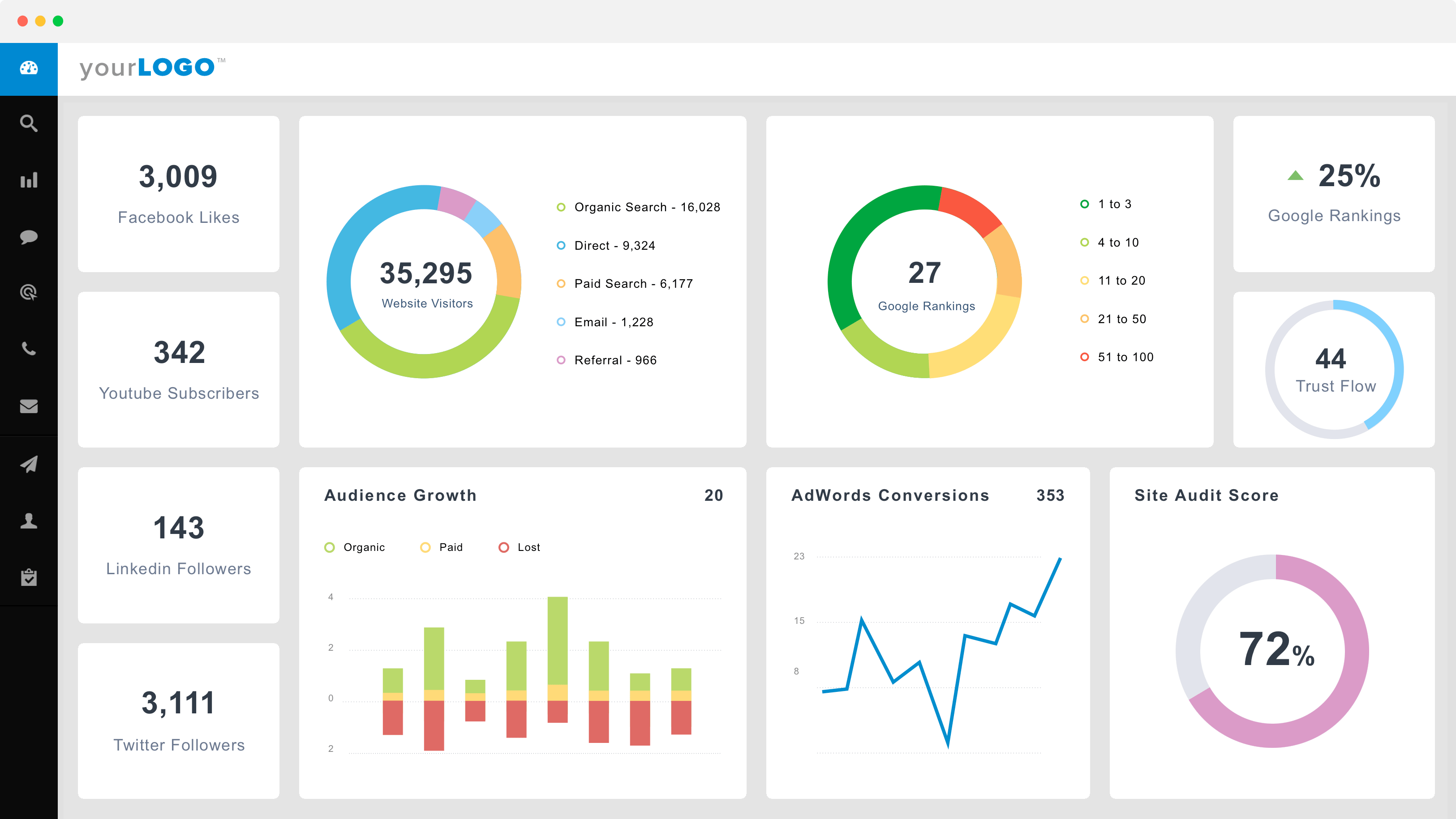
There are different types of concepts that will enable the person to make a better quality of dashboard design. By following these simple rules a success in the form of the great dashboard is unavoidable. These top design concepts for the enterprise dashboard are marked to be as follows:
Explain the Main Purpose of the Dashboard
A dashboard should be made with the specific kind of the purpose so that it can tackle to serve, like any of the other business product. The efforts become meaningless in the case of getting inaccurate renders. There are various kinds of popular ways to categorize dashboard according to their purpose. To keep the things simple and clear here are two basic types of the dashboard:
Operational Dashboard
The main aim of such kind of dashboard is to convey critical kind of information to their users in a quick way due to their engaged attitude in time-sensitive jobs. The important goal of this dashboard is to show the variations of data quickly to their users in a clear way by showing their ongoing resources and their status.
Analytical Dashboard
Contrary to the operational dashboard, this type of dashboard gives their users the glance information that is used for the making of decisions and analysis. The analytical dashboard seems to be less sensitive to time and not concentrate on the immediate kind of actions. The analytical dashboard contains the main goal to help their users so that they can make great sense of their data and to examine trends.
For self-satisfaction, it will be up to the users which type of dashboard they choose. Regarding the qualities managers with lower tear might require an operational dashboard, whereas, on the other hand, a higher kind of management need the second option of the dashboard.
Selection of Right Representation for Data
The representation of data is marked to be the complex task especially like on the dashboard. While working on this the user tries to represent various kinds of information in the form of active and stable changes over time. This action might prove to be challenging for users. The misinterpretation of data takes place in the situation when the wrong type of chart was selected or making defaults to the common type indulge the users to a confusing situation. Before the start of the process, the user should have to look at the inner reports and the documents to get some piece of inspiration.
For the purpose to select the right kind of representation for the chart, as a user you should have to ask yourself these different questions:
- Some variables you want to represent in a single kind of chart?
- Whether the values are displayed over time or among the groups or items?
- For each kind of variable how many data points should be displayed?
Clarity and Consistency
The concept of clarity and consistency matters a lot in designing better enterprise dashboard. As we know that the important goal of a dashboard is to receive the message in a quick way where every small thing is calculated. A great advantage of using the clear kind of framework is the consistency of data. If in each tool the data is named in the same way then it became much easier for the user to use those tools.
Explain the Layout
Consistency and effective alignment will be achieved by the help of the grids with small effort. By this effort, a basic kind of structure will be created that is marked to be the skeleton of the design. These grids contain some of the invisible lines on which the elements of the design are to be placed. By this action, all of the elements will be tied with each other in the whole system that proves to be the great rational support for the composition. This process seems to be critical for the design of the dashboard as in the seamless way tons of information are organized by the user.
While at the time of making decisions about the information where it should be placed keep these simple things in mind:
- Basically left side at the top of the screen will get more awareness. Due to this attention, it proves a useful key for the user to place key information from left side to right. This might be different in the condition of change in the region for whom the design is created. This point is only based on the fact that how and on which way we use to read the information. The information will be shifted to the next row after the finishing of the first row.
- If there are some kind of dependencies that will cause a certain kind of effect in decision making on the information of one group by the information to another. In this way, the main duty is to create the layout in such a way that there will be no need to go back and forth. To make the scanning easy a continuous kind of the flow is created.
Use of Building Blocks with a Consistent Structure
After the explanation of the grid, we as users can be able to start work with various kinds of widgets. These widgets play an important role in holding of the information, charts and control them. The arrangement of the cards will become easy in this process. The infinite manipulation is marked to be the important aspect of these cards. Due to this feature, these cards were considered to be a good choice for a responsive kind of design. This point was present at the time since the cards act like a content container that can easily be scale up or down by the users.
The most important aspect about cards is that they contain consistent kind of the layout of the controls and the data present inside. First of all, on the left corner place the name, make alignment in such a way that view controls or actions will be placed in the top right corner, and for the content leave rest of the information. At the time when all of the cards contain the consistent structure then it became easy for the user to work. In the interface, they can easily work because they will be able to find each and everything where they should be expected.
The feature of the layout contains some additional kinds of benefits like great flexibility at the time of response or the customization of the user. While at the same time the cards get large or small but all of the main components will remain in the same or specific location. This advantage proves to be very much beneficial for the developers and the whole scalability of the design in the future when you use it.
Doubling of Margins
In the design white space is also marked to be the negative space. This space is the specific area that is present between the elements in the composition of the design. There is less awareness of space by the readers but on the other hand, the developers put great attention towards this aspect. In the situation when there is no any kind of balance in the white space it will become hard for the readers to read that copy. That is why we can say that this space matters a lot as like to any other type of the typography element.
Disclose Information
As the main purpose of the dashboard is to send the information to their users in a quick manner, depending on scrolling or many other kinds of interactions weakens the whole of this purpose.
By the designing of dashboards with a long scroll is considered to be one of the main mistakes that most of the designers do. Regarding this factor, they try to display more piece of information clearly and simply. They place one information after another so that the user becomes overwhelmed. The only information that is visible above the screen will be discovered by the user. Users give little attention to the information that is present below the screen. The solution for reason is prioritization. A person will be able to identify more information after doing several kinds of research and interviews. In this situation, the work will be only done by the space that is present above the fold to display it. Neither the full story nor the summary is required, here only the key information is required. To fit the maximum amount of data the user become over flooded by that and get frustrated.
In the process, interactions help to surface only secondary information. If a person fully relies on those interactions and considered them the main thing to work with the dashboard, will be their great mistake.
In order to make the extreme cases, the main duty of the developer is to make an informative type of dashboard. The person should be focused while making the design and not allow multiple things in their mind. Too much data and demands can also over flooded the user and lead them to the state of confusion. To make a view, the use of five to seven widgets are appropriate. The situation for the users will become hard in the case using many widgets by which the user will be unable to focus and also not get clarity.
Personalization rather than Customization
Here the expectations of the users will become high and they demand that the content they see should be relevant to the needs of an individual. Customization and personalization are marked to be the simple techniques by which you can ensure that only things are seen by the users that matter to them.
The technique of personalization is done by the system itself. Id of the system is set to identify the users. Along with it, the content was also delivered, their experience and also their functions so that they can match their role. The customization technique is performed by the user itself. To meet the specific needs the system will allow their users to make certain kinds of changes and customize to their experience.
Data should be Interactive and Aligned Correctly
At the time when the maximum amount of information has to be displayed for a great toll-free number of items, a solution in the form of the data table is represented. Along with this maximum amount information it also provides several other benefits. These benefits are in the form of excellent use of space, simple scalability, uncomplicated in the development process and comfortable source of working along with grids. It is considered to be easy and the simplest way to find and bring changes.
Design Dashboard at the End
The designing of the dashboard takes place at the end of the process after the settlement of various information. It is because the dashboard is the summary view of anything else where the key information is displayed from the several parts of the application, this is the practical step to design the dashboard at the end. In the situation when the dashboard was designed first, constantly you have to go back and update the designs of the dashboard while at the same time when working on other pages. If the designs of the majority of views are prepared you get a lot of components to do work at the time of putting the dashboard together.
So these are marked to be the important concepts that should be kept in mind to design the better or best enterprise dashboard. Here the consistency and clarity matter a lot to remove the element of frustration and confusion from the minds of the users.
Any queries? feel free to contact web development services company