To design an incredible website means creating a website that responds to all screen sizes. The screens cut across different laptops, tablets, desktops, and smartphones sizes. Today, people spend around 4.2 hours on smartphones per day. The global web traffic of 54.85% comes from mobile devices. It makes a robust commercial argument to optimize mobile devices.
Website mobile versions don’t capture many tablets and smartphones’ screen resolutions. They also don’t capture different sizes at play. It makes responsive web design important. It’s the ability to build a website independent of adaptability. Here, you will know what responsive web designing is and its benefits.
Responsive web design
Gartner says a responsive web design is a client-side technique. It supports many layouts on one website. In layman’s language, RWD is a web design approach that ensures websites work and looks well. It does this for all app screens and devices. There is a relationship between responsive design and the GUI (graphic user interface).
RWD automatically scales elements and content to ensure users can see what they need to see. There are no cropped images or missing pieces.
Adaptive vs. responsive web design
There are only two frameworks/approaches to develop mobile websites. The adaptive approach and the responsive web design approach. They both result in optimized websites for mobile gadgets. The websites have spaced, positioned, and sizes optimized for different screen sizes.
Responsive design has design elements developed to scale on any device size. The responsive design is a version that changes automatically. The change depends on the user screen size. The design is cheap and fast. One mistake in padding or image sizing will affect the user experience on small devices.
Adaptive website design targets a specific class of devices. The server decides the type of version the website serves on each device type. It’s an expensive approach with a great optimized user experience on specific devices.
The three components of responsive web design
How will you make your website responsive? Please include the following three components to help it respond to different devices:
-
Media Queries
They are filters added to CSS. They respond to screen type, device type, device orientation, or even display browser. These queries aim to permit different layouts using the same content blocks. Each layout gets optimized for the device features or size. Media query design rules rely on maximum or minimum width parameters. They also rely on other factors like browser, orientation, and resolutions.
-
Fluid grids
Responsive web designs use an algorithm. First, it normalizes UI elements screen sizes and pixels through the “Liquid Layout” process. Next, the process considers every component by width percentage – image. It also considers content block, padding around and between blocks. Finally, it builds a complete width of 100%.
-
Flexible visuals
You need to create images in units called epx (effective pixels) to the spacing. You then express layout dimensions. The elements need a design base of 4 epx. It makes sure the design scales to whole numbers when fluid grid application.
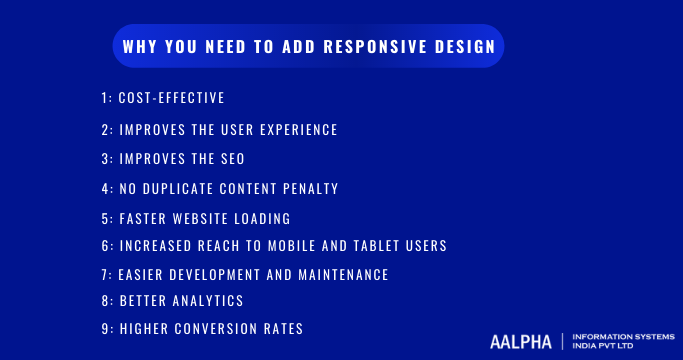
The seven essential reasons why you need to add responsive design
-
Cost-effective
Instead of designing diverse screen sizes, the web designer can make adjustments once. In addition, it’s cheap for the long-term whenever there is an update, new screen size, or an A/B test.
-
Improves the user experience
The current users need a fluid and consistent experience on all channels. For instance, in retail, buyers may start their journey on mobile and advance to a laptop or a desktop device. Responsive web design should offer a consistent experience to users at all touchpoints. Responsive web designs also ensure that designs have a nice look. The look should be without unnecessary scrolling, zooming, or pinching to navigate.
-
Improves the SEO
Responsive web designs improve search engine optimization (SEO). It also limits SEO risks that associate with different mobile websites. It does this in the below mentioned ways:
-
No duplicate content penalty
With mobile website versions, businesses risk the duplicate content penalty. Google bots can’t tell the version of the site to index or track to link the metrics. A single website version reduces the risks. It also permits web teams to concentrate their SEO efforts on one site.
-
Faster website loading
Google has ranking factors of over 200 in its algorithm on any site. The responsive sites load faster than the mobile targeted designs. Performance budgets, adaptive images, and compressions can improve web designs.
-
Increased reach to mobile and tablet users
Websites designed to respond to mobile users lead to a sticky client experience. Around 74% of people on a mobile-friendly website are likely to return, while 64% will buy. However, 61% who never get what they want on a mobile site will never return to it.
-
Easier development and maintenance
It’s faster to develop a single website version than several versions of the same. The main aim of the marketing and development teams is to have a website that works and looks good. In addition, the site should have the latest updates and content.
To make a responsive website, you have a choice to update, maintain and improve it over time.
-
Better analytics
Insights are effective if you track the consumer journey at all touchpoints. Adaptive web design, marketers, and IT collate and track data to various webs. It makes it hard to track insights. It’s easy to get meaningful insight and set up analytics if you use a single responsive web.
-
Higher conversion rates
The online retail traffic on mobile is 64%, but the mobile conversion rates are half of the desktop rates. Many factors influence the conversion rates in mobiles. They include:
- Complicated navigation (19.3%)
- Unseen product details (19.6%)
- Complicated browsing (19.6%)
- Complex input of details (18.3%).
Many mobile websites fail to convert since they aren’t responsive.
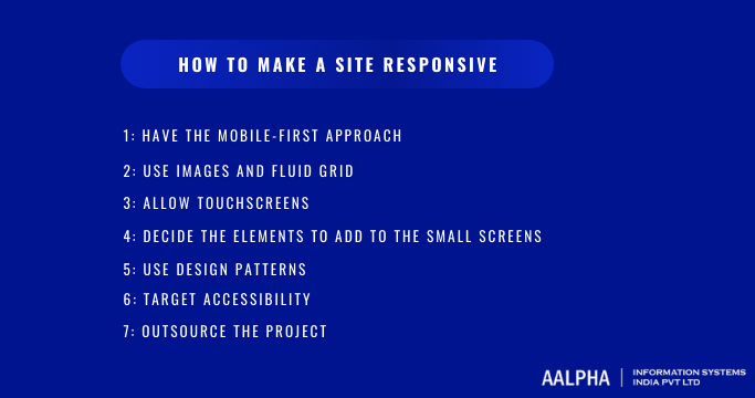
How to make a site responsive
Use these practices to make the design elements flexible.
-
Have the mobile-first approach
Mobile sites have more enormous UX challenges. Scaling up and designing for mobiles generate the best results. Make sure the designs are intuitive on every size and layout, especially the tiny mobile size.
-
Use images and fluid grid
Make images with a 4 px base to ensure their scale fits any percentage in the fluid grid format—test standard breakpoints for laptops, mobile, desktop, and tablet displays.
-
Allow touchscreens
User interfaces are different depending on interaction methods: a touchscreen vs. a mouse and keyboard. The touchable elements need to be prominent on small screens. In addition, the screens need simple navigation, adequate wipe space, and responsive links.
-
Decide the elements to add to the small screens
Responsive breakpoints help designers to decide what happens in every layout style. Decide what is visually and functionally crucial on small screens to give support.
-
Use design patterns
The design patterns are in five categories:
- Column drops
- Fluid, tiny tweaks
- Off-canvas
- Layout shifter.
The patterns help define when blocks or columns shift from a column to multi-columns.
-
Target accessibility
Accessible web designing use four principles of web accessibility. They include: operable, perceivable, understandable, and robust. The accessibility should have enough contrast and focus-able active elements. It needs to have an extensive test design and accessibility features. These features should support machine learning.
-
Outsource the project
Outsource the project to the team of experts to handle the tasks on your behalf. For instance, businesses looking for MSP website design solutions can benefit from teams specializing in creating tailored, responsive sites for managed service providers. Include only the organizations that have transparent processes on every project step. They should be able to do testing throughout the entire project.
Conclusion
To design mobile device websites is vital to succeeding in the current market for a business of any size. A responsive web design is cheap to maintain. It’s also wide enough for different screens and devices.
For more information feel free to connect with web development company.


