
Designing and developing a website is one of the crucial activities skilled developers consider in their daily schedule. However, with design, the placement of buttons on your website matters a lot. Every kind of button on your website has a role to play and, therefore, a need for understanding the proper location to place them. For example, call-to-action buttons are crucial and should be placed centrally at a point a user can see before scrolling the website. Apart from just placing the buttons anywhere, it is vital to ensure best practices follow up to the placement of these buttons.
Therefore, in this piece, we shall explore these practices and understand crucial areas where you can place controls on your website. There are three essential areas on your website where you can place your buttons for the best user experience. Let’s explore each area extensively and understand why it is vital to place Call-to-Action buttons.
Above the fold
More often, when you navigate through a wide range of websites, you will understand that most websites have their buttons placed above the fold. Situating the button in these areas means that once the user accesses the website, it will be the first thing to hit their face. It is one of the things users will first access or focus on before they can get into engagement with other elements within the website. Placing a button or buttons above the fold means that you should also incorporate other extra features that rhyme with the button – doing so generates a perfect user experience for the user before they can think of scrolling further down to access more content.
Additional elements you can consider after adding the buttons include an excellent and descriptive website title or what the website intends to do. A different complimentary subheader makes it even perfect. Considering some brief benefit statements just above the button is also crucial. Remember to describe the button adequately so that the user understands whatever they will experience after clicking it.
Button placement below the fold
There are different marketing strategies you can always consider for your website. Marketing revolves around four crucial entities: interest, attention, action, and desire. The four entities serve as an essential guide to help you correctly place the buttons on your website. In addition, they are an indispensable guide in helping you set the call-to-action buttons below the fold at the bottom of the webpage. Achieving these individual aspects of marketing through button placement below the fold can occur through different possibilities. Using an appropriate and punchy headline is one way to achieve the user’s attention when placing buttons below the page.
Capturing a user’s interest requires incorporating some videos or other content that can easily pull the user closer so that they can focus on the page at hand. If you want to capture users’ desire and interest using buttons, you should consider adding lists and extra features that might look appealing and beneficial to users.
Button placement below the fold with the use of directional cues
Another crucial consideration in placing buttons on your website is using directional cues regardless of where you situate the button. This approach is common among mobile designers and developers because mobile phones have limited screens. Therefore, to use the user interface appropriately, it is always advisable to consider using arrows and other direction pointers. Therefore, such design and button placement approaches require you to place buttons below and above the fold. Situating call to action buttons above the fold allows users to quickly click or navigate to whatever they what or know in advance.
Additional placement of buttons below the fold always gives users of a website a chance to digest more information and make proper conversions as they desire. However, considering button placement below and above the side, it is crucial to remember that using a wide range of limitless buttons on a webpage wouldn’t serve as a good design practice. Therefore, as a good button placement technique, it Is crucial to avoid cluttering the buttons almost anywhere on the page. Most readers consider the “F” pattern of reading through the website once they land on a website. Therefore, it is crucial to follow the same approach in placing buttons on the webpage, that is, to the left rather than the right. Doing so is essential because the left will always attract more website users. It is also crucial to avoid the clutter of call-to-action buttons all-round the webpage.
Labeling buttons on your website or webpage
Highlighting whatever each button does is an easier task, and anyone can do it. However easier it might sound; it is crucial to understand the importance of adequately labeling buttons. Without clarity in the labels, it might be difficult for users to understand each button’s role. Therefore, it is crucial to have knowledge of the basics common to labeling buttons so that developers can increase user interface design and experience in different ways. Unclear labels on buttons will always mislead users with no clear idea of the website’s performance. Therefore, we should assume that the users don’t know about the website or webpage when labeling buttons.
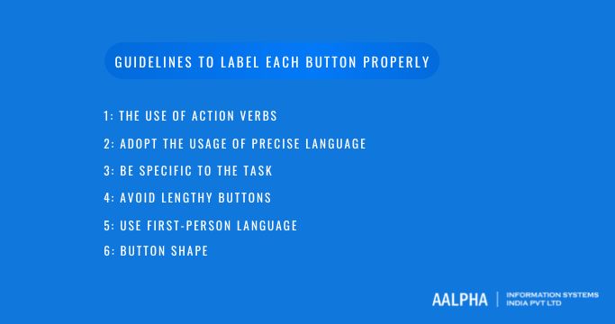
The following are fundamental guidelines to help you label each button properly:
-
The use of action verbs
Sometimes, buttons may require one-worded phrases to describe them. Even though it might be a good practice to consider, it is essential to keep focusing on making the user understand what the button does when clicked. You can consistently achieve that through action verbs because they provide a better description of the next step the user should expect after clicking the button. For instance, the use of “Yes” or “No” phrases limit the user so that they cannot understand what they are accepting or denying. In such circumstances, it is essential to give a hand in providing descriptive action verbs. Such labels give the user the confidence to click the buttons because they have a proper understanding of the role played by the button. However, ensure the action verbs you use are not so long for the button.
-
Adopt the usage of precise language
With most languages, you’ll encounter words with similar meanings but serving different connotations respective to context. For this reason, developers should always stick to precise terms that won’t cause misunderstandings among users. Cut off the doubt and misunderstandings among users by using exact words on your button labels.
-
Be specific to the task
Generic and vague language isn’t a great practice, especially when you want to develop an up to standard design. You will often want to let your website users understand whatever action a button takes after a click. In most instances, you might use vague language that increases vagueness on your website. It is essential to avoid common words that tell the user what they already know. For instance, using words such as “click here” could be too vague to consider as a developer.
The user understands that each button is to be clicked but doesn’t understand the action taken by each button. The specificity of each button’s task should flow to every button on the webpage. Some of the best labels you can use instead of vague language include “post” or “submit,” which are common when a user wants to deliver some form-filled information to the database. Therefore, instead of pointing out what the button does, focus on the action taken by the button upon clicking.
-
Avoid lengthy buttons
Most of your buttons should be standard in size. Lengthy and confusing buttons sometimes disgust users; any developer should avoid this practice. Wordy buttons come from using long phrases; in handling wordy buttons, it is essential to consider using commands. For example, you can quickly drop subjects and unnecessary articles in a single label with controls.
-
Use first-person language
The clarity in your labels sets in with using the appropriate language in first-person. Using first-person language means the user should take action, motivating them to click it when appropriate. To emphasize whatever, you point out through the button label, you must use proper icons on the call-to-action buttons. According to statistics, many people would prefer to click buttons with arrows or icons compared to those with labels alone. `
-
Button shape
The shape of your button matters a lot and, therefore an essential factor for any developer. Consequently, it is undeniably true that button shapes significantly impact the appropriateness and effectiveness of call-to-action buttons. Regarding button shapes, it is essential to consider rounded buttons as they tend to generate more attraction and attention. On the other hand, buttons with sharp corners don’t attract users, as users tend to avoid sharp objects on the website.
Conclusion
Many different button placement strategies and practices will put your website’s interface to the next level. It is good to consider the above approaches to give users a good experience and interaction with your website. Avoid cluttering buttons anywhere on your website, and you’ll be fit to satisfy most of your customers.
To know more best practices of button placement, contact web design company in India.