





TL;DR
AI startup website design is the process of building a website that explains an AI product clearly enough for a stranger to understand it in under a minute, trust it enough to try it, and convert into a signup, demo request, or paying customer. It differs from generic SaaS website design because the product itself is harder to picture. A CRM shows a screenshot and the visitor understands the value. An AI product that scores sales calls, drafts legal clauses, or predicts churn needs to show its input, its output, and the gap it closes before a visitor believes it works. Founders often turn to a web development company like Aalpha for this exact reason, since building an AI startup site takes both design judgment and technical depth that generic templates cannot deliver. This guide covers planning, page structure, homepage design, UX and visual design, product explanation and demos, trust and conversion, SEO and AI-search visibility, and development and launch, plus the cost ranges and platform choices founders actually face.
1. What is AI startup website design?
AI startup website design is the discipline of designing and building a marketing and product website for a company whose core offering is an AI-driven product, model, or platform. It sits at the intersection of SaaS website design, product marketing, and technical communication. The website has to do three jobs a normal business site does not: explain a product that has no physical form, prove the AI actually works before the visitor has used it, and answer questions about data and accuracy that a restaurant website or a law firm website never has to answer.
How AI startup websites differ from traditional business websites. A traditional business website sells something the visitor already understands: a service, a product, a location. An AI startup website sells something the visitor is skeptical of by default. Most visitors in 2026 have used at least one AI tool that overpromised, so the starting position is doubt rather than curiosity. The website has to close that gap with specifics, not enthusiasm.
Why website design matters for AI startups. For an early-stage AI company, the website is frequently the only touchpoint a prospect gets before deciding whether to book a call. There is no sales rep in the room to answer “but does it actually work on my data.” The site has to do that job through copy, demos, and proof, which is why AI startups tend to invest disproportionately in product explanation compared to companies selling something more familiar.
Main goals of an AI startup website. The goals are usually layered: get the visitor to understand what the product does within the first screen, get them to believe it works through demonstration or proof, and get them to take one specific next action, whether that is a self-serve signup, a demo booking, or a waitlist join. A site trying to do all three equally well on every page usually does none of them well. Most AI startups need to pick a primary conversion goal per page and build toward it.
Common challenges when presenting AI products online. Founders building these sites run into the same handful of problems. The product is abstract, so copy defaults to vague language like “AI-powered insights” that means nothing to a first-time visitor. The team is engineering-heavy, so the site skews toward technical accuracy and away from persuasion. And the category moves fast, so messaging that made sense six months ago now sounds dated or gets lost among a dozen competitors saying the same thing. A fourth problem shows up later but costs more: the product changes faster than the website. A model gets swapped, a new capability ships, pricing shifts from seat-based to usage-based, and the website keeps describing a version of the product that no longer exists. Sales teams end up correcting the site in every call, which is a sign the site should have been updated first.
Balancing product education, branding, and conversion. The sites that convert well treat education as part of the funnel rather than a separate concern from conversion. Every explanation of how the product works should also be moving the visitor toward a decision. Branding matters, but for an early-stage AI company it usually matters less than clarity. A visitor who understands the product in fifteen seconds and trusts a plain design will convert at a higher rate than one who is impressed by the visuals but still unsure what the product does.
2. Planning an AI startup website
-
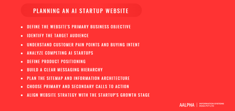
Define the website’s primary business objective
Before any design work starts, the team needs to agree on what the site is for. A pre-seed startup validating a concept needs a waitlist and enough clarity to get investor and early-adopter interest. A funded startup with a working product needs self-serve signups or demo bookings. An enterprise-focused AI company needs qualified leads more than raw traffic. These three objectives lead to different homepages, different CTAs, and different amounts of gated content, so skipping this step is the single most common reason AI startup websites underperform.
-
Identify the target audience
Most AI startups sell to more than one type of buyer. A developer tool might be evaluated by an engineer and purchased by a VP of engineering. A sales AI product might be used by reps and bought by a sales ops leader. The website needs to speak to whichever persona actually starts the buying process, and separate content should exist for the others rather than trying to write one page that satisfies everyone.
-
Understand customer pain points and buying intent
Founders often describe their product from the technology side: what model it uses, how the pipeline works, what makes the architecture novel. Buyers arrive with a problem, not a curiosity about architecture. The website copy needs to start from the pain, whether that is hours lost to manual data entry, missed anomalies in fraud detection, or slow customer support response times, and work backward to the product. Interviewing five to ten recent customers or trial users about the exact words they used to describe the problem before they found the product is worth more than a week of internal messaging workshops, because that language, not the founding team’s internal vocabulary, is what belongs on the site.
-
Analyze competing AI startups
A quick audit of five to ten direct competitors reveals the messaging patterns the market has already normalized, which ones to avoid repeating word for word, and which gaps are still open. If every competitor leads with “AI-powered platform for X,” that phrase has stopped differentiating anyone, and the new site should lead with something more specific.
-
Define product positioning
Positioning answers one question: compared to what, and why this instead. An AI startup usually competes against three alternatives at once: doing the task manually, using a general-purpose tool like ChatGPT, and using a narrower point solution. The website should make clear which of these the product replaces and what is lost by not switching.
-
Build a clear messaging hierarchy
A messaging hierarchy is the ordered list of what the visitor needs to know first, second, and third. Typically that order is: what the product does, who it is for, what result it produces, and how it works. Sites that lead with “how it works” before establishing what the product does lose visitors who never get far enough to care about the mechanism.
-
Plan the sitemap and information architecture
The sitemap should map to the buyer’s decision path rather than to the org chart of the company. A visitor evaluating the product moves through recognition, understanding, trust, and decision. Pages should be structured to support that path: homepage for recognition, product and use case pages for understanding, case studies and security pages for trust, and pricing or demo pages for decision.
-
Choose primary and secondary calls to action
Most AI startup pages need exactly one primary CTA and, at most, one secondary CTA for visitors not ready for the primary ask. Common pairs are “Start free trial” paired with “Watch demo,” or “Book a demo” paired with “See pricing.” More than two competing CTAs on a page reliably lowers conversion because the visitor has to decide what to do instead of just doing it.
-
Align website strategy with the startup’s growth stage
A pre-launch company needs a site built around validation: waitlist signups, early access requests, and enough narrative to attract press or investors. A company past product-market fit needs a site built around scale: SEO content, self-serve conversion paths, and enterprise trust signals. Building a scale-stage site for a pre-launch product wastes budget on pages nobody will visit yet.
3. Essential pages for an AI startup website
An AI startup rarely needs every page type on day one, but knowing the full set makes it easier to sequence what gets built first.
Homepage. The entry point for most traffic and the page that has to do the most work in the least space. It sets the value proposition, shows proof, and routes different visitor types to the right next page.
Product and feature pages. These go deeper than the homepage into specific capabilities. For an AI product, this is where technical buyers verify that the product actually does what the marketing claims, so vague feature lists underperform detailed ones with real screenshots.
Use case pages. Rather than organizing by feature, use case pages organize by job: “Automate customer support triage,” “Summarize sales calls,” “Detect invoice fraud.” These pages tend to convert better than feature pages for visitors who arrived searching for a solution to a specific problem rather than shopping for AI capability in the abstract.
Industry-specific pages. For AI startups selling into more than one vertical, industry pages let a healthcare buyer see healthcare-relevant proof and a fintech buyer see fintech-relevant proof on the same core product, without the homepage having to serve both audiences at once.
Pricing page. Even usage-based or credit-based AI products benefit from a public pricing page, because ambiguity about cost is a common reason technical evaluators abandon a signup before trying the product.
About page. For an AI company, the about page often does trust work that a services company’s about page does not: it establishes who built the model or system, what domain expertise the team has, and why they are credible on this specific problem.
Customer stories and case studies. Concrete before-and-after numbers from a named or anonymized customer do more to overcome AI skepticism than any amount of homepage copy. A case study with a specific metric, such as reducing response time from four hours to eleven minutes, outperforms a generic testimonial by a wide margin.
Integrations page. Buyers evaluating an AI tool want to know it fits into their existing stack before they invest time in a trial. A clear integrations page, even a simple grid of logos with brief descriptions, removes a common blocker.
API and developer documentation. For products with a developer audience, documentation quality is itself a conversion factor. Poorly organized docs cost signups from technical buyers who judge the whole product by how well the API is explained.
Security and compliance page. This page answers the questions every enterprise buyer’s security team will ask: where is data stored, is it used to train models, what certifications does the company hold, and what happens to data after a contract ends. Skipping this page pushes those conversations later into the sales cycle, where they slow deals down.
Blog and resource center. Beyond SEO value, a blog lets an AI startup demonstrate expertise on the problem it solves, which matters more for trust in this category than in most others.
Contact and demo pages. These should be short and specific about what happens after submission: who will respond, how quickly, and what the call will cover. Vague “get in touch” forms convert worse than forms that set a clear expectation.
4. How to design a high-converting AI startup homepage
Create a clear and focused hero section. The hero section is the headline, subheadline, and primary CTA visible without scrolling. For an AI product, this space needs to answer “what is this” before anything else, because a visitor who cannot answer that question in five seconds leaves. Avoid opening with the technology; open with the outcome.
Write a strong value proposition. A value proposition that works names the audience, the problem, and the result in one or two sentences. “AI-powered platform for modern teams” says nothing. “Turn customer support tickets into resolved issues in under two minutes, without adding headcount” says something specific enough to test itself against reality.
Explain who the product is for. A line or short phrase naming the target user, such as “Built for revenue operations teams at B2B SaaS companies,” helps the right visitor self-identify quickly and helps the wrong visitor leave before wasting time, which is a win for both the visitor and the startup’s lead quality.
Show the AI product in action. This is the single highest-leverage element on an AI startup homepage. A static screenshot, a fifteen-second looping video, or an embedded interactive demo does more to build belief than any amount of descriptive copy. If the product cannot yet be shown live, a recorded walkthrough of a real session is the next best option; a stock illustration of a robot is not.
Present key benefits and outcomes. Once the visitor understands what the product does, the next section should state the two or three outcomes that matter most, backed by specifics where possible: time saved, error rate reduced, revenue recovered. Generic benefit language such as “increase efficiency” should be replaced with a number whenever the company has one.
Add customer logos and social proof. Logos placed just below the hero section signal that other companies have already made the decision the visitor is considering. For an AI startup without well-known logos yet, usage numbers, review scores, or notable investors can serve the same function temporarily.
Explain how the product works. A short, visual explanation, often three or four steps, of how input becomes output builds understanding without requiring a demo call. This section should stay concrete: “Upload your call recordings, the model tags objections and next steps, your team reviews the summary in Slack” is more useful than “our proprietary pipeline processes your data through advanced machine learning models.”
Highlight important use cases. A short section linking out to the two or three most common use cases lets different visitor segments self-select into the content most relevant to them, rather than forcing everyone through the same generic pitch.
Present integrations and security information. Even a brief mention on the homepage, such as a row of integration logos or a one-line security statement with a link to the full page, reduces friction for buyers who would otherwise need to ask.
Use clear calls to action. Every major section of the homepage should support the same primary action rather than introducing a new one. If the primary CTA is “Start free trial,” repeating that language throughout the page reinforces the decision instead of asking the visitor to choose between several different next steps each time.
Build an effective homepage content flow. The strongest AI startup homepages follow a consistent logical sequence: hero, proof, product demonstration, benefits, how it works, use cases, deeper social proof such as case studies, objection handling such as security or pricing transparency, and a final CTA. Skipping the middle of this sequence and jumping straight from hero to pricing loses visitors who were not yet convinced.
5. AI startup UX, UI, and visual design principles
Keep complex AI products simple to understand. The underlying system might involve multiple models, retrieval pipelines, or fine-tuning steps, but the interface and the website copy describing it should hide that complexity behind a simple mental model. Visitors do not need to understand the architecture to trust the outcome.
Create a strong visual hierarchy. Headlines, subheads, and body copy need clear size and weight differences so a scanning visitor, which is most visitors, can follow the argument of the page without reading every word.
Reduce cognitive load. Every additional choice on a page, whether that is a navigation item, a CTA, or a design element competing for attention, costs the visitor mental effort. AI startup sites benefit from fewer choices per screen than most other categories, because the product itself already requires effort to understand.
Build intuitive navigation. Navigation should map to how a buyer thinks, not how the company is organized internally. “Product,” “Use cases,” “Pricing,” “Docs,” and “Company” cover most AI startups without needing a dropdown five levels deep.
Design clear user journeys. Each entry point, whether from an ad, an organic search result, or a referral, should lead the visitor down a coherent path toward the primary conversion goal rather than dropping them on a generic page and hoping they find their own way.
Maintain consistency across the interface. Button styles, spacing, iconography, and terminology should stay consistent site-wide. Inconsistency reads as unfinished, which undermines trust in a product that is already asking visitors to trust something intangible.
Choose suitable typography and colors. Typography should prioritize legibility at small sizes, since a meaningful share of AI startup traffic now arrives on mobile. Color should be used deliberately: one primary accent color for CTAs and key highlights, and a restrained neutral palette for everything else. Dark backgrounds have become common in this category because they read as more technical, but a dark theme only helps if contrast ratios stay high enough for body text to remain comfortable to read; a dark site with low-contrast gray-on-gray copy trades a design trend for legibility, which is a poor exchange for a page whose main job is explaining something complicated.
Use product screenshots and UI previews. Real screenshots of the actual product outperform illustrations and abstract graphics almost every time, because they let the visitor evaluate the product directly rather than trusting a description of it.
Apply animation and motion carefully. Subtle motion, such as a number counting up or a card animating into view on scroll, can reinforce that the product is dynamic and modern. Motion used purely for decoration, especially anything that delays the visitor from reading content, works against conversion.
Avoid generic futuristic AI visuals. Purple-to-blue gradients, glowing neural network graphics, and humanoid robot illustrations have become so common across the category that they now signal “generic AI startup” rather than differentiating anything. A site that skips these in favor of real product imagery and a distinct color identity stands out simply by not looking like every other AI landing page from the last two years.
Build a distinctive AI brand identity. Distinctiveness usually comes from specificity: a particular typeface pairing, an unusual but consistent color, an illustration style that is not stock, or a tone of voice that sounds like a person rather than a press release. None of this requires a large budget, but it does require deliberate choices instead of default template settings.
Design for mobile responsiveness. Interactive demos and data-dense dashboards are the hardest elements to adapt to small screens and the most likely to be skipped in a rushed build. They need explicit mobile treatment, not just a responsive grid that shrinks everything proportionally.
Follow accessibility best practices. Sufficient color contrast, keyboard navigability, and alt text on product images are not optional extras. They also tend to overlap with good SEO practice, since search engines evaluate many of the same signals.
6. How to explain and demonstrate an AI product
Explain what the AI product does in simple language. The test is whether someone with no context can read one sentence and repeat back what the product does. “We use advanced machine learning to optimize your workflows” fails that test. “We read your incoming support tickets and draft a reply your team can approve in one click” passes it.
Focus on business outcomes instead of technical jargon. A buyer evaluating a fraud detection tool cares about false positive rates and dollars saved, not about the specific model architecture. Technical depth belongs on a dedicated page for technical evaluators, not in the primary explanation on the homepage.
Clearly show inputs and outputs. For almost any AI product, the fastest way to build understanding is a simple before-and-after: here is the raw input, here is what the product produces from it. A side-by-side of a messy spreadsheet and a cleaned, categorized output communicates more in one image than several paragraphs of description.
Use product screenshots and recorded demos. A recorded demo does not need production polish. A short, honest screen recording of the actual product solving a real task, narrated plainly, tends to build more trust than a scripted marketing video, because it looks like the product actually works rather than like an advertisement for it.
Add interactive demonstrations where appropriate. For products where the interaction itself is the value, such as a chatbot or a data analysis tool, letting a visitor try a limited, sandboxed version directly on the website removes the biggest source of doubt: whether the product works on something resembling their own data.
Show before-and-after examples. Beyond raw input and output, showing the state of a process before adoption and after, such as a support queue with a two-day backlog compared to same-day resolution, ties the product to a business result the visitor already cares about.
Explain AI workflows visually. A simple flow diagram, three or four steps with short labels, communicates a pipeline faster than a paragraph describing the same sequence. This works particularly well for products with a multi-step process, such as document ingestion, extraction, and validation.
Demonstrate accuracy, speed, and reliability. Specific numbers, even approximate ones drawn from real usage, matter here: “94% extraction accuracy across 40,000 processed documents” is credible in a way that “highly accurate” is not. If the company does not yet have production numbers, benchmark results against a known dataset can serve as an interim proof point, clearly labeled as such. Speed claims need the same treatment. “Processes a 40-page contract in under 20 seconds” is verifiable and specific; “lightning fast” is not, and a technical buyer who has been burned by a slow AI tool before will discount the second claim automatically. Where reliability matters, such as an uptime commitment for an API-based product, stating the actual figure and linking to a status page does more for enterprise trust than a paragraph of reassurance.
Explain human-in-the-loop processes where relevant. Many buyers are more comfortable adopting an AI product when they understand a human retains final approval on consequential decisions. Stating this plainly, rather than hiding it, often increases trust rather than undermining the pitch for automation.
Communicate limitations transparently. Every AI product has edge cases where it performs worse. Naming one or two of these, along with how the product handles them, such as flagging low-confidence outputs for human review, reads as more credible than a page that claims the product is right every time. Buyers who have used AI tools before will assume limitations exist regardless; addressing them directly removes the doubt instead of leaving it unspoken.
Provide technical details for advanced and enterprise buyers. A dedicated technical page or documentation section, covering model choices, data handling, latency, and integration methods, satisfies the more rigorous evaluation that enterprise technical teams require without cluttering the primary marketing pages meant for a broader audience.
7. Building trust, credibility, and conversions
Add customer logos. Even a handful of recognizable or industry-relevant logos, placed prominently, signals that the product has survived contact with real customers rather than existing only as a demo.
Use authentic testimonials. A testimonial with a name, title, and company, ideally alongside a photo, carries far more weight than an anonymous quote. Specific language in the quote itself, referencing a particular result or moment of realization, reads as more genuine than generic praise.
Publish detailed case studies. The most persuasive case studies follow a simple structure: the problem the customer had, what they tried before, why they chose this product, and the measurable result after adoption. A case study without a number is closer to a testimonial than a case study.
Present measurable product results. Wherever the company has real usage data, whether that is total documents processed, hours saved, or revenue influenced, aggregate numbers on the homepage or an about page build credibility that individual customer stories reinforce but cannot replace on their own.
Highlight founder and team credibility. For an AI startup, the team’s domain expertise or technical background is itself a trust signal. A founder with direct experience in the problem space, or an engineering team with a strong AI research background, is worth stating plainly on the about page.
Mention investors, accelerators, or partnerships where relevant. Recognizable investor names or accelerator affiliations act as third-party validation for visitors unfamiliar with the company, particularly for enterprise buyers who use funding signals as a proxy for stability.
Explain data privacy practices. Buyers want a plain-language answer to whether their data trains the underlying model, how long data is retained, and who can access it. Burying this in a long legal document instead of stating it clearly on a security page is one of the more common trust failures on AI startup sites.
Communicate security measures. Encryption standards, access controls, and infrastructure choices, such as which cloud provider hosts the data, reassure technically literate buyers doing their own diligence before involving procurement.
Address AI transparency and responsible use. A short, honest statement about how the model was trained, what data sources were used, and what steps are taken to reduce bias or hallucination addresses a concern that is now routine in enterprise AI procurement conversations.
Present compliance certifications. SOC 2, GDPR compliance, and ISO certifications, where the company holds them, should be stated clearly with badges or a short description rather than assumed to be implied by the word “secure.”
Choose the right conversion goal. The right primary conversion depends on the product’s complexity and price point. Simple, low-cost, self-explanatory products convert well on free trials. Complex or expensive products, especially ones requiring integration work, convert better on demo requests, where a sales conversation can address the specific fit questions a webpage cannot.
Free trial vs demo vs waitlist. A free trial signals confidence and works when a visitor can get value within minutes without help. A demo request works when the product needs context to evaluate properly, such as enterprise workflow tools. A waitlist works for pre-launch products and serves the secondary purpose of building a list to launch to later.
Optimize forms and landing pages. Every field removed from a signup or demo form tends to increase completion rate. Asking only for what is truly needed at that stage, such as email and company name, and deferring the rest to a later step, keeps the initial commitment small.
Reduce conversion friction. Friction shows up in small places: a CTA button that does not clearly state what happens next, a form that resets on error, a demo booking flow that takes visitors off-site to an unfamiliar scheduling tool without warning. Each of these costs a percentage of otherwise-interested visitors. Requiring a credit card for a free trial is one of the more consequential friction points specific to this category; it filters out the casual technical evaluators who make up a meaningful share of early AI product adoption, even though it also filters out some low-intent signups the sales team would not have wanted anyway. Which tradeoff is correct depends on the product’s cost to run per trial user, not on a general rule.
Add social proof near important CTAs. Placing a logo strip, a short testimonial, or a usage statistic directly next to the primary CTA, rather than only in a separate section of the page, reinforces the decision at the exact moment the visitor is making it.
Use A/B testing. Headline wording, CTA phrasing, and hero section layout are the highest-leverage elements to test first, since small changes to any of them tend to move conversion more than changes deeper in the page.
Track conversion metrics and user behavior. Session recordings and funnel analytics reveal where visitors actually drop off, which is frequently different from where the team assumes the problem is. A page that looks fine in review often has a specific, fixable friction point visible only in real user behavior.
8. SEO and content strategy for AI startup websites
Conduct keyword and search intent research. AI startup keyword research needs to separate category-level searches, such as “AI writing tool,” which are highly competitive and often low-intent, from specific problem searches, such as “automate contract redlining,” which convert at a much higher rate despite lower volume.
Optimize product and feature pages. Each core feature deserves its own page, targeting the specific terms buyers search when evaluating that capability, rather than folding every feature into a single crowded page that ranks for nothing in particular.
Create use case landing pages. Use case pages tend to be the strongest organic acquisition channel for AI startups, because they match how a frustrated buyer actually searches: by task, not by product category.
Build industry-specific pages. For companies selling into multiple verticals, industry pages capture searches that include an industry qualifier, such as “AI scheduling software for clinics,” which general product pages rarely rank for.
Develop integration pages. A dedicated page for each major integration, such as “Connect to Salesforce,” captures branded searches from buyers already using that tool and looking for compatible options.
Create comparison and alternative pages. Pages titled along the lines of “X vs Y” or “Best alternatives to Z” capture buyers actively comparing options, which is often the highest-intent traffic an AI startup can rank for, provided the comparison is honest rather than one-sided marketing.
Use product-led SEO. Where the product itself can generate publicly indexable pages, such as a directory of AI-generated summaries, templates, or reports, this content compounds over time in a way blog posts alone do not, though it requires careful quality control to avoid thin or duplicate pages.
Build educational blog content. Blog content that answers real questions buyers have about the problem space, not just about the product, builds topical relevance and captures earlier-stage searches before a visitor knows a solution like this exists.
Strengthen topical authority. Search engines and AI answer engines increasingly reward sites that cover a topic comprehensively rather than sites with a single strong page. A cluster of interlinked content around one core problem outperforms scattered individual posts on unrelated topics.
Improve technical SEO. Many AI startup sites are built as single-page JavaScript applications, which can create indexing problems if server-side rendering or pre-rendering is not configured correctly. This is a common, quietly costly mistake that shows up as pages simply never appearing in search results.
Optimize Core Web Vitals. Interactive demos, embedded videos, and heavy animation, all common on AI startup sites, are also common causes of poor loading performance. Performance budgets need to be set deliberately rather than assumed to be fine.
Implement structured data. Schema markup for organization, product, FAQ, and article types helps search engines and AI systems parse page content accurately, which matters increasingly for visibility in AI-generated search summaries.
Build a strong internal linking structure. Linking from blog content to relevant product and use case pages, and from those pages back to supporting case studies, distributes authority across the site and gives visitors a natural next step at every stage. A common gap is the orphaned blog post that ranks well but links nowhere: it earns traffic and converts almost none of it, because a reader who finishes the article has no obvious path to the product page relevant to what they just read.
Optimize for Google AI Overviews and AI-assisted search. Content structured with clear, direct answers near the top of a section, specific data points, and well-organized headings is more likely to be cited or summarized by AI-generated search results, which are increasingly the first thing a searcher sees before clicking through to any website.
Maintain clear EEAT signals across the website. Experience, expertise, authoritativeness, and trustworthiness signals, such as named authors with real credentials, cited sources, and transparent company information, matter more for AI and machine learning content than for most other categories, because search engines apply extra scrutiny to claims in this space.
9. AI startup website development, cost, and launch process
Choose between Webflow, Framer, WordPress, and custom development. Webflow and Framer suit early-stage AI startups that need a polished, fast-to-launch marketing site without engineering resources tied up in it. WordPress remains a reasonable choice when the team already has WordPress expertise or needs a large content operation with a mature plugin ecosystem. Custom development becomes worthwhile once the site needs deep product integration, such as an embedded live demo pulling from the actual product API, or once traffic and content volume outgrow what a website builder handles well.
Decide when React or Next.js is appropriate. Next.js is the common choice when a marketing site needs to share components or authentication with the product application, when interactive demos require real application logic rather than a scripted animation, or when the team wants full control over performance and SEO configuration that page builders abstract away.
Consider headless CMS architecture. A headless CMS, paired with a custom or semi-custom frontend, gives content teams the ability to publish blog posts, case studies, and landing pages without engineering involvement, while keeping the frontend fast and fully customizable. This pattern has become common for AI startups that expect to scale content volume significantly.
Plan product and API integrations. Live demos, usage counters, or personalized content pulled from the product itself require early planning for how the marketing site authenticates against and calls the product’s API, which is a meaningfully different technical problem than a standard content website.
Add analytics and marketing tools. Beyond standard analytics, AI startups typically need product analytics connected from day one, since understanding what a trial user does after signup is often more important than understanding what a visitor does before it.
Optimize website speed and security. Image optimization, code splitting, and a CDN are baseline requirements. Security matters visibly here too: a marketing site with an expired SSL certificate or an obviously outdated framework undermines the security claims made elsewhere on the site.
Factors affecting AI startup website design cost. Website design cost depends primarily on three variables: the number of unique page templates needed, whether the site includes custom interactive elements such as live demos, and whether content, including copywriting and case study production, is included in scope or handled separately. A template-based site on Webflow with a handful of pages can run in the low thousands of dollars. A mid-range build, custom design applied to a Webflow or lightweight Next.js foundation with ten to fifteen page templates and a working CMS, typically lands in the mid five figures. A custom Next.js site with an interactive product demo tied to the real product API, a headless CMS, and a full content strategy including case study production typically runs from the high five figures into six figures, depending on scope and the region of the development team. Region matters more here than founders often expect: the same scope of work priced through a US or UK-based agency and through an offshore team with comparable senior engineering talent can differ by two to three times, which is why many funded AI startups now split the work, keeping product-critical integration work in-house or with a specialized partner while outsourcing the broader build.
Freelancer vs agency vs in-house development. A freelancer suits a narrowly scoped, well-specified project with a founder who can manage the process closely. An agency suits a project needing coordinated design, development, content, and SEO under one accountable team, which is common for AI startups that need to move fast without hiring a full internal team. In-house development becomes worthwhile once the website is a continuously evolving product surface rather than a one-time build.
Discovery and research. This phase covers competitor analysis, audience research, and defining the primary business objective, typically taking one to two weeks depending on how much of this work the founding team has already done internally.
Messaging and information architecture. Before any visual design starts, the messaging hierarchy and sitemap need to be locked, since redesigning copy after visual design is underway is a common and expensive rework cycle.
Wireframing. Low-fidelity layouts establish content structure and hierarchy without the distraction of color and imagery, letting the team validate the flow of each page before investing in polished design.
UI design. Visual design applies the brand system, typography, color, and imagery to the validated wireframes, producing the final look of each page template.
Prototyping. An interactive prototype, particularly for pages with complex interactions like an embedded demo, lets the team test the experience before development begins, catching usability issues that are far cheaper to fix at this stage than after launch.
Development. Frontend and backend development, including any CMS setup and API integrations, is typically the longest phase, particularly for custom-built sites with interactive product elements.
Content and SEO implementation. Copywriting, case study production, and on-page SEO implementation often run in parallel with development rather than after it, since content gaps discovered late in the process delay launch.
Testing and QA. Cross-browser and cross-device testing, along with performance and accessibility checks, should happen before launch rather than being treated as a post-launch cleanup task.
Launch. A phased launch, such as a soft launch to existing users or an email list before a broader public announcement, catches issues at lower stakes than launching directly to a press cycle or a large ad spend.
Post-launch analytics and optimization. The site’s first version is a starting point, not a finished product. Conversion data collected in the weeks after launch typically surfaces two or three clear opportunities for improvement that were not obvious during the design process.
Common AI startup website design mistakes. The recurring ones are worth naming directly: leading with technology instead of outcome, using generic AI visuals that make the site indistinguishable from competitors, hiding the product behind a demo request when a live preview would convert better, skipping the security and data privacy page until a deal stalls on it, and treating the site as a one-time project instead of an asset that needs regular updates as the product and market evolve.
10. Why choose Aalpha Information Systems for AI startup website design?
Aalpha Information Systems has been building custom software and web platforms since 2008, with more than 5,500 completed projects for clients across 55 or more countries, including organizations such as the World Bank, Bausch and Lomb, Swiss Re, Zee5, and Emaar. That experience spans well beyond marketing websites into the AI, SaaS, and product engineering work that AI startup founders actually need a technical partner for.
The team combines UI and UX design with conversion-focused website planning, so the sites built are not just visually finished but structured around the buyer journey described throughout this guide. On the frontend, Aalpha works in React, Next.js, and modern JavaScript frameworks, which covers the custom, product-integrated builds that a Webflow template cannot support, including embedded live demos and personalized content pulled from a product’s own API. On the backend, the team works across Python, Node.js, PHP, dotNET, and Java, and has direct experience integrating AI models and third-party APIs into production systems rather than only into marketing pages.
Cloud deployment expertise across AWS, Azure, and Google Cloud means the infrastructure decisions behind a fast, secure site are handled by people who also build the production systems those sites need to represent accurately. Aalpha builds marketing websites, SaaS platforms, dashboards, and AI-powered applications under one roof, which matters for AI startups whose website and product are more entangled than a typical company’s.
The engagement model is flexible enough to work for an early-stage startup that needs a focused, budget-conscious build and for a growing company that needs an ongoing web and product development partner. Aalpha holds ISO 9001:2015 certification and carries a 4.9 out of 5 rating from more than 215 Clutch reviews, and support continues past launch with maintenance, performance optimization, and new feature development as the product and website evolve together.
Discuss your AI startup website design requirements with Aalpha. Get in touch with our team to talk through your product, target buyers, and what your website needs to communicate before development begins.
Final words
An AI startup website earns its budget back when a stranger can land on it, understand the product without a call, and either try it or ask for a demo within a few minutes. That outcome depends less on visual polish than on the order and honesty of the explanation: what the product does, proof that it works, what happens to the visitor’s data, and one clear next step. Sites that lead with technology instead of outcome, or that lean on generic AI imagery instead of a real product screenshot, lose visitors before the pitch even starts.
Treat the site as a product in its own right rather than a one-time deliverable. The messaging that worked at launch will age as the category moves and as the company’s own product changes, and the highest-performing AI startup sites are the ones revisited every few months against real conversion data rather than left untouched for a year after launch.
Frequently asked questions
What is AI startup website design?
It is the process of designing and building a website for a company whose core product is AI-driven, structured to explain an abstract product clearly, prove it works, and convert visitors into trial users, demo bookings, or customers.
How is an AI startup website different from a SaaS website?
An AI startup website has to overcome more upfront skepticism and explain a less tangible product, which usually means more emphasis on demonstration, input and output examples, and data privacy explanation than a typical SaaS site needs.
What pages should an AI startup website have?
At minimum a homepage, product or feature pages, a pricing page, an about page, and a way to request a demo or start a trial. As the company grows, use case pages, case studies, a security page, and documentation typically get added.
How much does an AI startup website cost?
A template-based site on a platform like Webflow can run from a few thousand dollars into the low tens of thousands. A custom-built site with interactive demos, a headless CMS, and full content production typically runs from the high five figures into six figures, depending on scope.
How long does it take to design and develop an AI startup website?
A template-based site can launch in two to four weeks. A custom-built site with product integrations and a full content strategy typically takes eight to sixteen weeks from discovery to launch.
What is the best platform for an AI startup website?
There is no single best platform. Webflow or Framer suit fast, polished marketing sites without deep product integration. Custom Next.js development suits sites that need embedded live demos or share components with the product itself.
Is Webflow or Framer suitable for an AI startup?
Yes, for a marketing site without complex product integration. Both platforms handle standard pages, forms, and CMS-driven blog content well and let non-technical teams manage content after launch.
When should an AI startup use custom development?
When the site needs to embed a live, functional product demo, pull data from the product’s own API, or scale to a content volume and traffic level that a page builder starts to strain under.
How do you explain a complex AI product on a website?
Start with the outcome, not the mechanism. Show a real input and output. Use a short visual explanation of the workflow rather than a technical description of the architecture, and reserve deep technical detail for a dedicated page aimed at technical evaluators.
What should an AI startup homepage include?
A clear hero section stating what the product does and for whom, proof the product works through a demo or screenshot, key outcomes with specifics where possible, social proof, a short explanation of how it works, and one consistent primary call to action.
How can an AI startup website build trust?
Through named customer testimonials, detailed case studies with real numbers, clear data privacy and security explanations, visible compliance certifications where held, and honest acknowledgment of the product’s limitations rather than only its strengths.
Should an AI startup show pricing on its website?
In most cases, yes, even for usage-based products. Hidden pricing is a common reason technical evaluators abandon a signup, since the absence of a number often reads as more expensive than the actual price would.
How important is SEO for an AI startup website?
It is one of the more durable acquisition channels available, particularly through use case and comparison pages that match how buyers actually search, but it requires deliberate technical setup since many AI startup sites are built as JavaScript applications that can be difficult for search engines to index correctly without proper configuration.
What are the most common AI startup website design mistakes?
Leading with technology instead of outcome, relying on generic AI stock imagery, withholding a live product demonstration, delaying the security and data privacy page until a deal stalls, and treating the site as finished after launch instead of as an asset to keep improving.
How often should an AI startup website be updated or redesigned?
Copy and proof points should be reviewed roughly every quarter as the product and category evolve. A full visual redesign is usually only necessary every two to three years, or sooner if conversion data shows the current design is underperforming against a clear benchmark.