


Today’s world is full of technological advancement where content with a poor design doesn’t stand out. It is considered to be useless. What attracts potential customers in whatever they want is the design. Nonetheless, it can be quite tricky to stay up on the top due to the ever-changing digital evolution.
The user is the common factor who determines different expectations from different angles. So, how do you satisfy the user design preference? As a digital expert, it is a must that you be adaptable to any change at any given point. This implies that to build up and maintain your brand as the most wanted; you should put all your focus on the user’s preference and wants. To achieve this, you must be updated with the latest trends when it comes to UX designs.
Let us discuss the following UX Design Trends for 2020
- The Dark Theme
- Inclusive Design
- No Passwords When Logging in
- Air Gesture Control
- Doing away with Hamburger Menus
- UX Writing
- Micro-Interactions
Just some years back, marketing and user experience were two distinct areas of study. But in this era, the two go hand in hand where each one is dependent on the other. Marketing has an important role when it comes to user experience because it defines how the user feels about the brand.
Let us now analyze each of the above named Trends
- The Dark Theme
Before technology, the backgrounds that were often used were made up of shiny and bright colours. But then, who wishes to stay at the same place forever? The digital world is all about evolution and change. From a scientific view, it is clear that eyes are never friendly to bright colours especially for a long period. Therefore, the dark theme took its way towards the transformation.
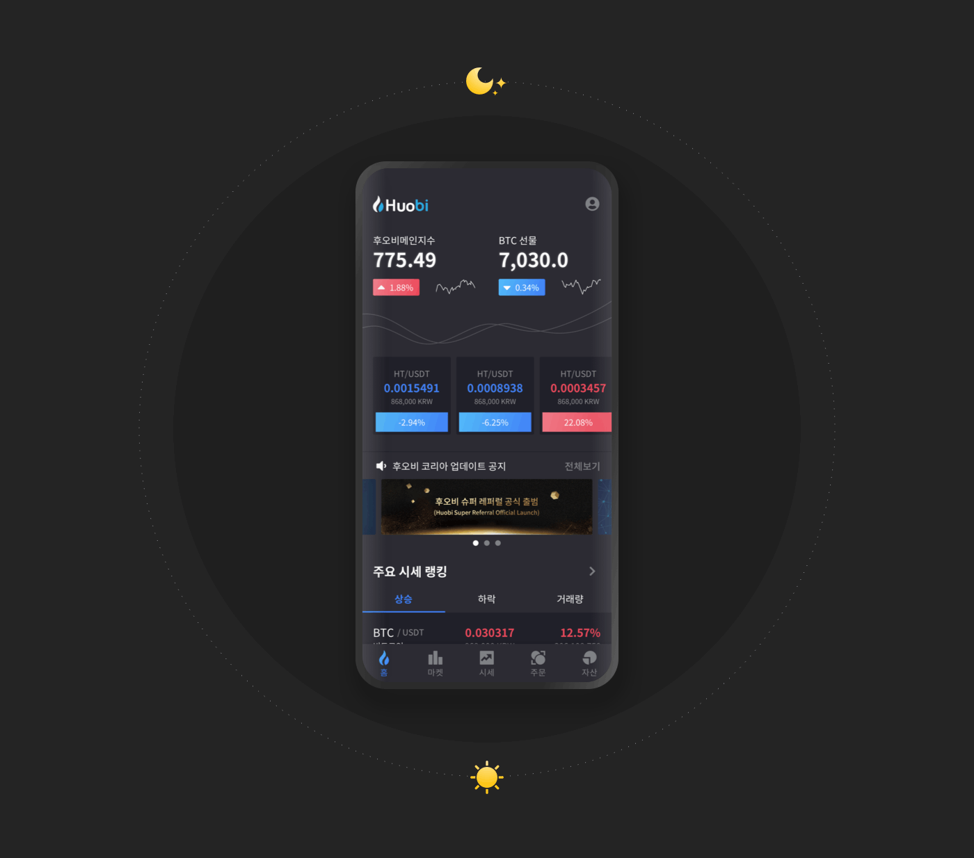

Major apps including Android and iOS, implemented the dark theme strategy, and this paved the way for many applications; they started going the same direction. The reason why dark theme stands out as a trend is a positive impact it brought after being used.
Most UX designers have adapted to this change and they can always modify themes to suit the preference of the user.
Note: The application you are using should support dark theme trend for you to use it effectively.
Some of the biggest applications using dark theme include:
- Netflix
- Spotify
- YouTube
- Amazon
However, there are applications which are perfect with bright themes such as social media platforms and websites for news.
As a designer, it is upon you to decide what works better for you and more so the preference of your audience. Always think wide and make a critical decision.
- Inclusive Design
In simple terms, inclusive design involves expanding your ideas by reaching out to different people on how to design. Different people give you their views and thought, which you, later on, combine with your ideas to come up with the best product. This trend is the most used, and it only means it won’t run out of the market any time soon.
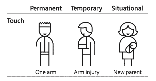

It is all about bringing and incorporating ideas gathered from different people from different field of experts. Everyone has their own views. As a designer, you combine all the different perspectives and come up with a brand or a product that suits everyone’s needs.
Note: What works for me might not work for you. And what works for you might not work for someone else, and the trend continues. That is why an inclusive design trend is here to solve the equation.
Principles of Inclusive Design
- One solution should be extended to many people: In the world of designing, those individuals with permanent disabilities should always be put first in mind. The design should be flexible and easy to use on such people. Thus, when people with disabilities are well catered for, a good number of people worldwide will as well benefit from this.
- Know what to ignore: Since different people will have their own perception in each matter, you can’t include all the perspectives in the design. As an expert, it is your duty to analyze what to add and what to ignore.
- Diversify Ideas: Always consider other people views before starting off with your design to avoid misunderstandings from the very beginning. This means that you should move with other peoples perspectives from the word go.
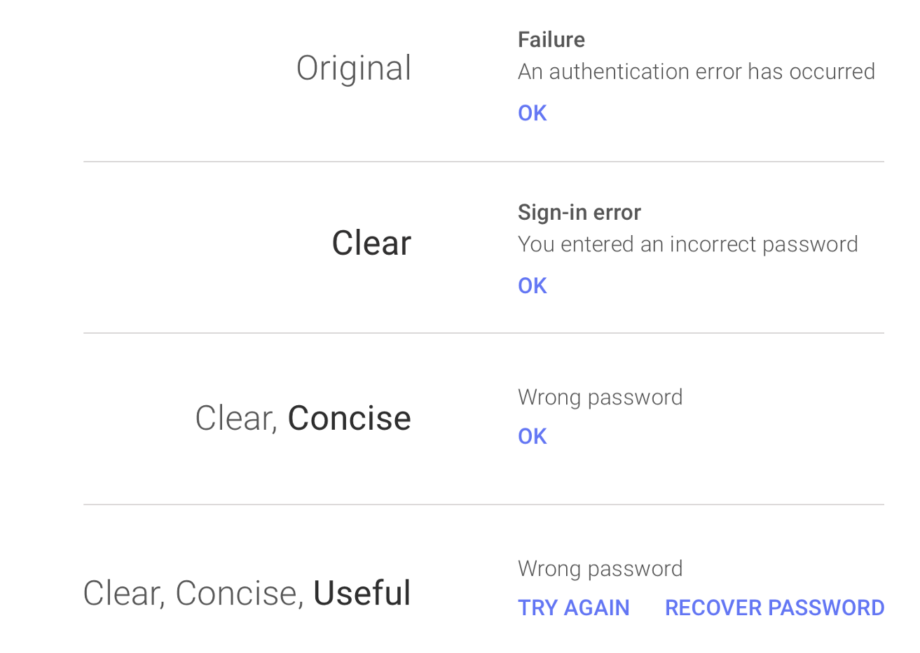
- No Passwords When Logging in
We are all human, and at times we tend to forget the most important things in our lives. Such things can be pins or even passwords. The same applies to any user out there. About 27.95% of users often forget passwords at least 10 times annually. This is according to Cyclonic passwords Security research.
It is a common scenario that users forget their passwords every other day. According to a Cyclonic Password Security Survey, 27.95% of respondents said that users forget their passwords 10 or more times per year.

Note: The reason why a person forgets a password is because of the rules involved like involving numbers, punctuation marks, or even special characters. Once you forget even one character or put a lower case in place of an uppercase, that is it. You won’t be able to log in and forced to reset passwords countless times.
That is why a trend of logging in without necessarily having to enter a password is here.
Passwordless login is an emerging trend in UX design that is not going to end any time soon. Most of the largest companies such as Microsoft are already implementing this strategy.
- Air Gesture Control
Another amazing UX trend is the air gesture. The trend is meant to improve the user experience when it comes to gesture experience. Since touch screens were implemented, a lot has changed.
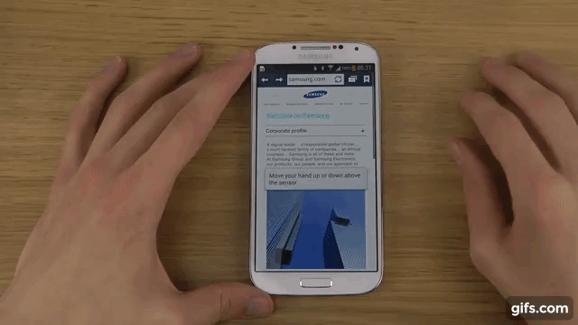

Note: Apple came up with the idea in the first place and initiated the trend in iOS. The trend did not just stick there. A lot of technological advancement has been made, and some are still in the process. For example, a simple pinch on the phone or even a wave over the phone will keep things moving. Users won’t have to touch on the screens to achieve an objective necessarily.
One key aspect of gesture control is the level of sensitivity. It has to be extra sensitive for it to act with ease. Air gesture is among the emerging trends that will keep improving on different dimensions as time moves on.
- Doing away with Hamburger Menus
The hamburger icon serves many people every day. The users are fond of its convenience, easy and flexible to use. Apparently, the usual menu design of 3 parallel lines is going out of trend slowly despite the fact that it makes the menu appear attractive.
The following shows why Hamburger is a UX emerging trends:
There is no much attention on the Features
The hamburger icon’s main role is to keep important services, vital information concerning the business, and products offered at large.
Low Click Rates at the top left corner
Do you have a touch screen phone? If yes, have you noticed that the hardest place to reach with your thumb is the top left corner? The same thing applies to the hamburger icon. Since the icon is located at the top left corner, many people find it difficult to access it, thereby leaving your application.
As a designer, it is up to you to think beyond hamburger icons. For example, Spotify is already on the move to do away with such icons. Once they removed the icon, productivity increased. This means that change is vital when it comes to designs.
- UX Writing
Catchy and straight to the point words are slowly losing their significance. We are living in an era where individuals only want to hear what they have already perceived in their minds. They need to hear something that steams up a constructive conversation and later on improve productivity. And that is what UX writing is all about. It catches the attention of the user by ensuring the user stays focused throughout.
A good and practical example is this; in Google, many users search for a hotel room to book, yet they are reluctant to make the reservation immediately. To catch their attention, a change of sentence is applied. The sentence can read, ‘Reserve your space” instead of ‘check available rooms.’

Tips on how to achieve UX writing
- Address the user the exact point they need to hear
- Put all the focus on the key point
- Embrace the use of active voice and past tense in the sentences.
- Do not let the user do more research about the objective. It should be instant.
- Make use of figures where necessary
- Micro-Interactions
Micro-interactions is whereby the design and the user cooperate to form a nice experience. It is all about playing with animation by adding them where necessary.
Note: You must be available to experience micro-interactions since it is the user where all the focus lies.
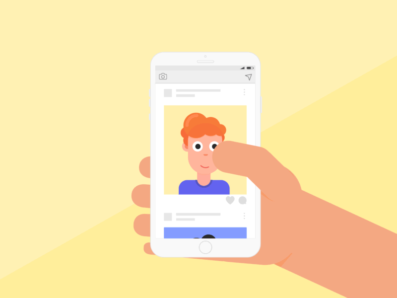
A good example is the like button of Facebook. It is the perfect moment to attract potential audience towards what you offer.
If you are looking for a UX Design Agency for your next project? then Aalpha can help, contact us today.